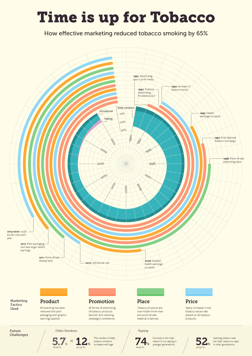
A deep dive into the smoking data provided plenty of insight into past and current smoking habits, along with nicotine usage in Australia. I discovered that marketing related to traditional tobacco had been very successful (Poster A). This was what we will call the good poster.
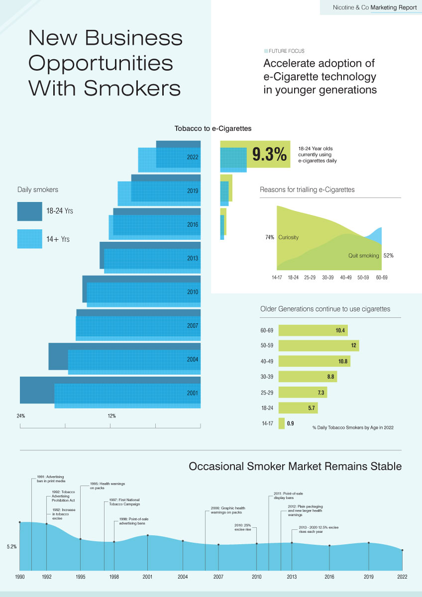
However, a concern was that at the same time, nicotine usage via vaping had dramatically increased in recent years among younger generations (poster B). We’ll call this the bad poster.
The designs developed were infographic-style charts designed to be relatively complex, allowing the viewer to enjoy the exploration and discover the key facts.
Below are the two posters. Same data, but completely different stories to tell.