City of Mitcham

Rebrand & Wayfinding

The Brief

As South Australia’s second-oldest Local Area Council, Mitcham has a lot to talk about. Stretching across the rolling foothills and encompassing Belair National Park, Flinders University and numerous heritage-listed buildings, it is home to many of Adelaide’s finest suburbs.

However, the identity has changed little in 172 years, with a Coat of Arms still in use and minimal, consistent brand elements available for communications. So this projects was really about giving the brand presentation a seriously big boost.

The Challenge

To create a brand identity that allows Mitcham to be positioned for the future while still being respectful of the past.

The Solution

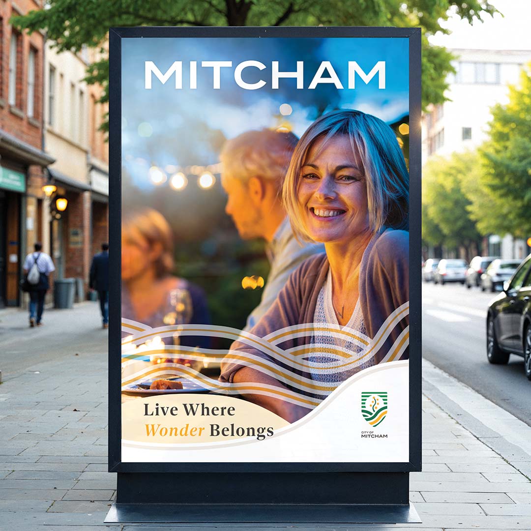
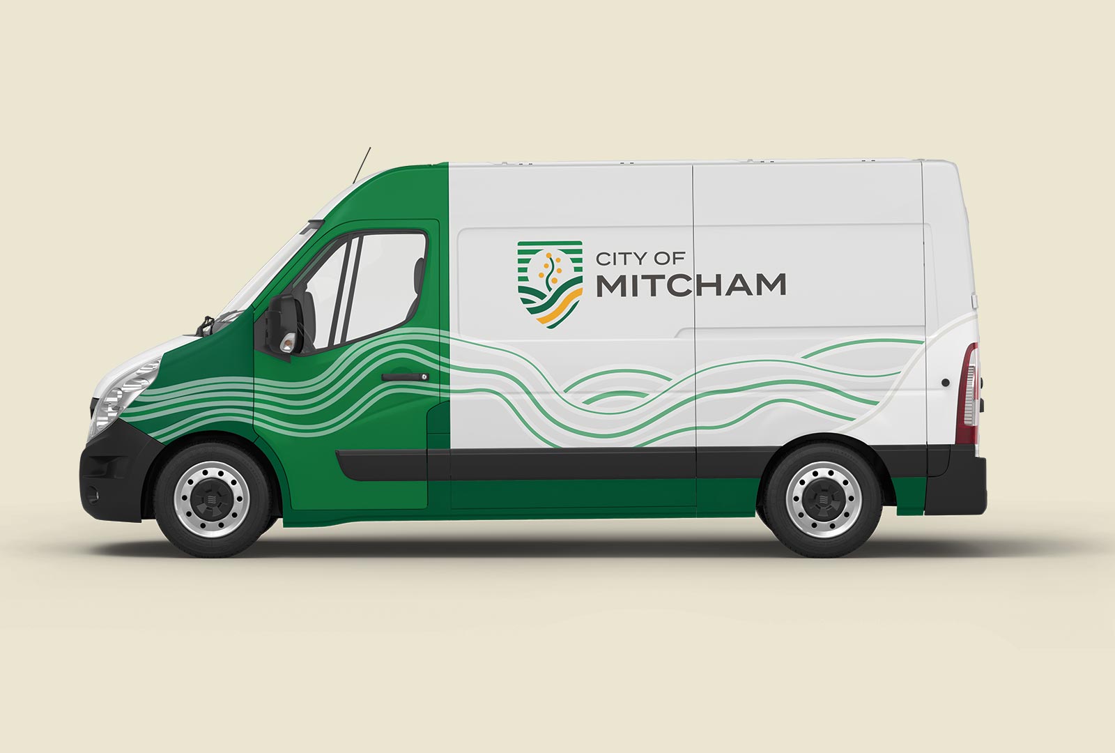
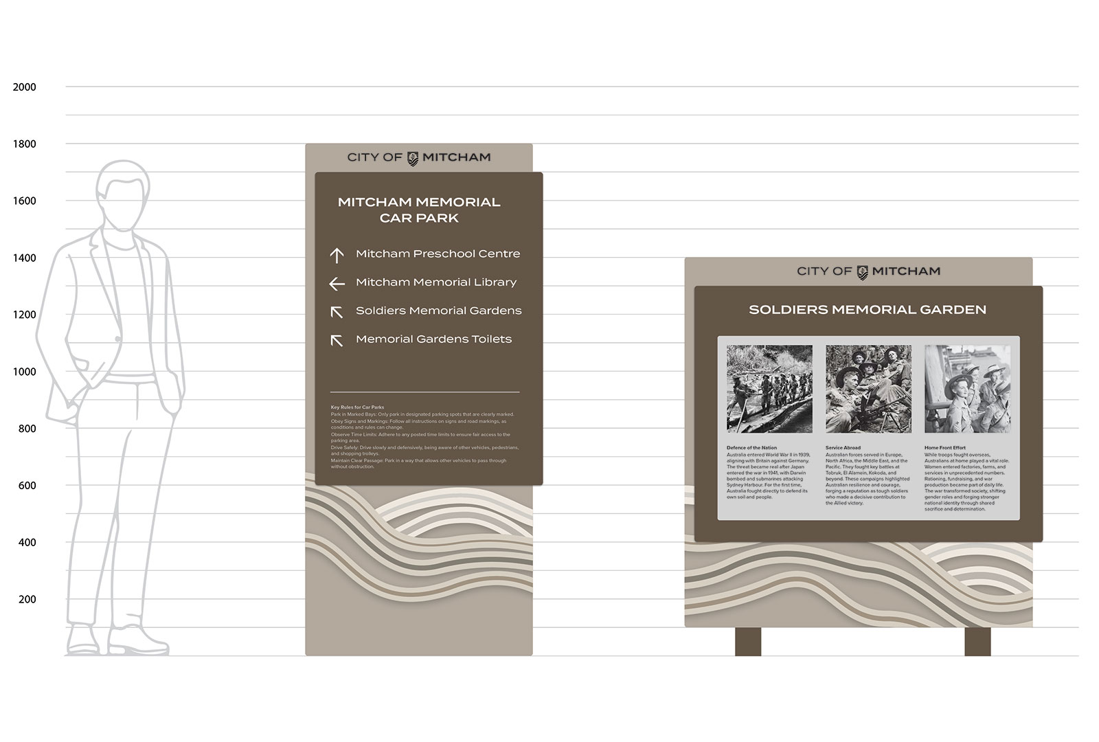
A significant amount of research was conducted to create a contemporary brand positioning, slogan, and identity system for use across signage, print, and digital communications.

A modern shield-style logo was designed, incorporating many iconic elements from the current heraldic-style coat of arms. The colour palette was designed to closely resemble the original colours for familiarity, but with a few tweaks to make it pop.

For flexibility, an additional vibrant colour palette and stylish serif typeface were chosen to enable the development of dynamic marketing material as required.