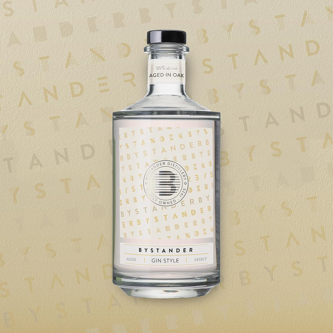
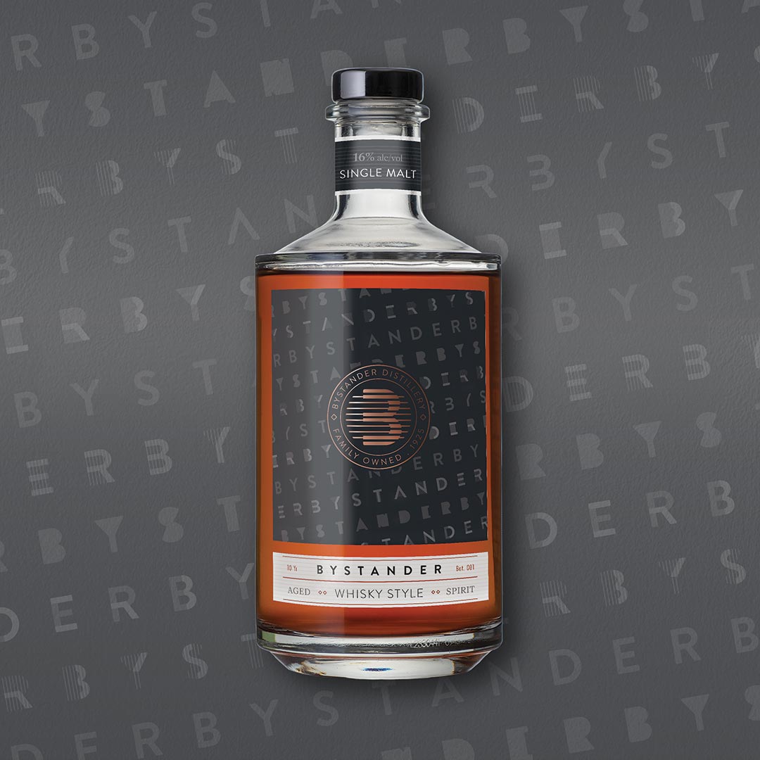
The heart of the bottle design is the typeface.
Inspired by the unique Bifur typeface created in the 1930s by Adolphe Cassandre. A custom Bifur-style typeface was created using Brandon Grotesk, which was used as a decorative element across both the bottles and marketing material. Colours for each variation were chosen to have familiarity with each respective spirit subcategory.
The Bystander name was chosen to represent the fact that a reduced alcohol spirit would have to stand alone (and stand out) in the crowded spirits category.
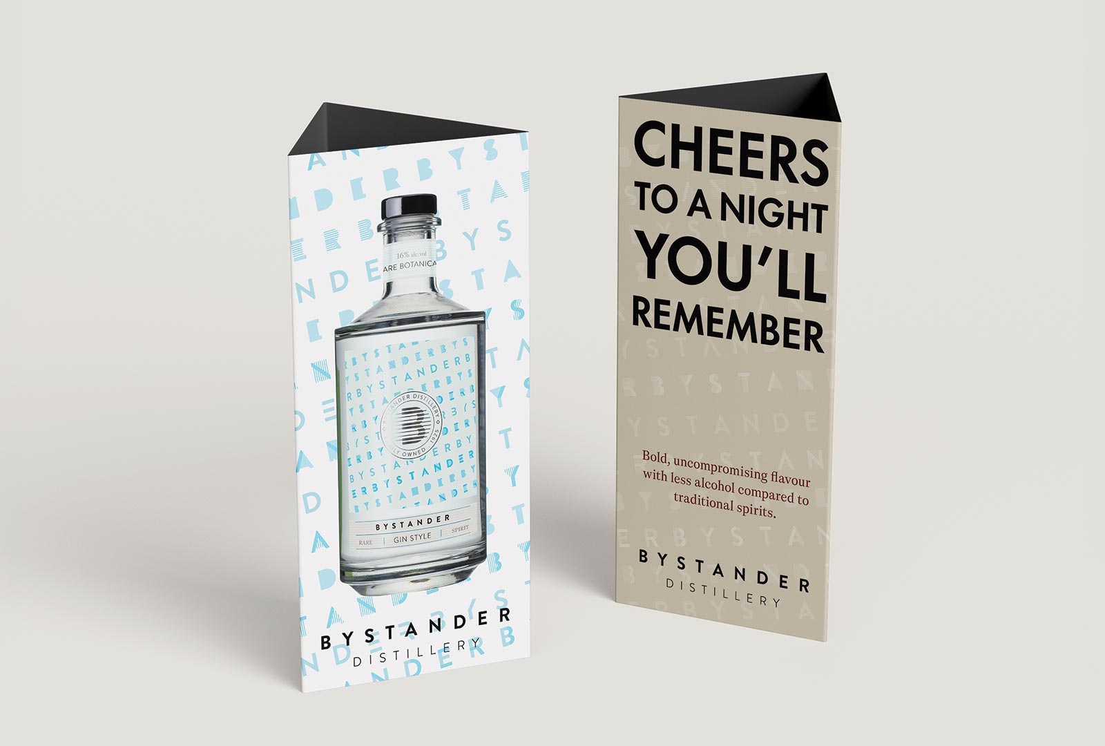
Advertising material was designed to be light-hearted, cheeky, and to remind customers of the benefits of a low-alcohol spirit.